Pantone Color of the Year: Very Pleased With Very Peri

It’s that time again: time to talk about the Pantone Color of the Year. The announcement of the new Color of the Year is always a fun time for artists and designers of all kinds as we begin thinking about and looking for inspiration for new projects for a new year.
For 2022, Pantone has chosen a pale shade of purple, a little less blue than periwinkle but not quite lilac, that they call Very Peri. Pantone describes the color as “displaying a carefree confidence and daring curiosity that animates our creative spirit.” I certainly find my curiosity piqued and my creativity roused by this intriguing color!
Though most of us hear of Pantone once a year, the company has been working year-round since 1963 to create and catalog color codes that match specific shades so that when designers and artists in a variety of industries choose a certain color, whether for print, packaging, or a product, its precise hue can be reproduced exactly. These codes and their corresponding shades are collected in the Pantone Matching System, used in product design, packaging, textiles, interior design, clothing, and other industries to ensure color consistency.
The Pantone Color Institute studies the influence of color on emotional responses and thought processes, and every year, they choose a Color of the Year that captures the zeitgeist or dominant cultural attitudes and concerns of the coming year. This year’s choice, Very Peri, is a new color Pantone has created to represent a time of transition. We’ve been through a period of isolation and introspection, which has led many people to reevaluate what they want in life. Transitional times like these are times when anything is possible, when you not only see the possibilities spread out before you but realize you have the power to choose a path and move yourself forward.
Whether you agree with their choices or not, their selections are always astute and thoughtful, and the discussions they generate show us how important color is in our lives. Color psychologists study the effects of color in different environments: the way color choices affect students in a classroom, patients in a hospital, or consumers deciding between two brands. But you don’t have to be an expert to reflect on the importance of color or to be moved by a particular hue. We all have an intuitive grasp on the power of color, our understanding evident when we’re picking out paint for our bedroom walls, a couch for the living room, or a new outfit. We have a good sense of what we like and what we don’t like and how our color preferences communicate something about who we are.
As a designer, I’m no different. Color is the basis of what I do. And as a jewelry designer, I have to be attentive to the different emotional resonances created by the interaction between color, shape, texture, and pattern. Color can make an abstract emotion into something concrete, our interpretations of color shaped by psychology and culture. The transitional nature of Very Peri, with its particular balance of blue and red, is a complex color that conveys complex emotions. That’s why I’m so excited to start designing around this color.
The Pantone color of the year is always a great jumping off point for my creative process. I’ll be looking at gemstones during my annual buying trip to Tucson with an eye towards violet hues and stones that compliment them to create new combinations that I hope will inspire others when they wear my designs.
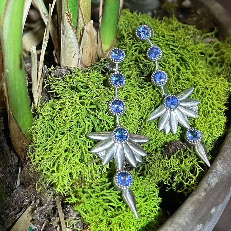
Our 8 Petal Earrings with 10 Matching Tanzanites, from the Ground Breaking Collection. This superb light, bluish violet is Very Peri!


